Plotting
Danger
Because latools offers the possibility of high-throughput analyses, it will be tempting to use it as an analytical ‘black box’. DO NOT DO THIS. It is vital to keep track of your data, and make sure you understand the processing being applied to it. The best way of doing this is by looking at your data.
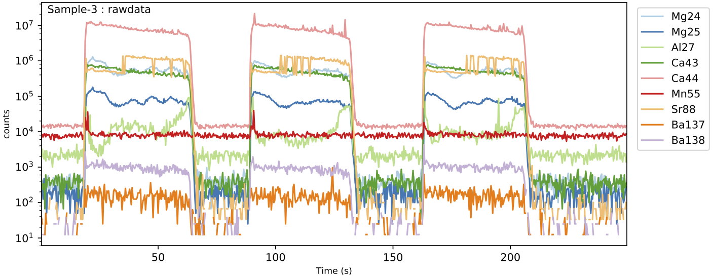
The main way to do this in latools is to Plot all your data, or subsets of samples and analytes, at any stage of analysis using trace_plots(). The resulting plots are saved as pdfs in the reports_data folder created during import, in a subdirectory labelled as the analysis stage. For example, making plots now will create 5 plots in a subdirectory called rawdata:
eg.trace_plots()
Tip
Plot appearance can be modified by specifying a range of parameters in this function. This will be used to some extent later in this tutorial, but see trace_plots() documentation for more details.
By default all analytes from the most recent stage of analysis are plotted on a log scale, and the plot should look something like this:
Once you’ve had a look at your data, you’re ready to start processing it.